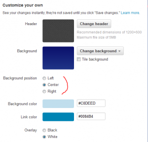
Not sure when this new feature was applied, but it is long over due. It probably happened when Twitter decided to allow additional branding with a “header” (learn more here). Background images on twitter allow for branding, personal expression and the ability to add additional information about oneself or a business. The problem was that all background images were forced to align “Top-Left”. This made it difficult for individuals and designers to get exact placement of the background image that would be effective on the large variety of monitors and resolutions currently in use.

YouTube had this figured out all along. Wonder why it took so long for Twitter to figure out.
By centering the background image and accounting for the overlay of the twitter space, designers can now ensure that their background image, text, branding, etc…, will not be lost off the left and right margins nor overlaid by the twitter space. There are plenty of websites highlighting the new space dimensions, but with a little trial and error, designers will be able to generate polished pages that will fit all monitors and resolutions.


